The Web Experience Is Still Horrible
Posted by Keith Elder | Posted in Internet | Posted on 02-03-2008
How many times as consumers have we seen stupid things on web sites that make us go, huh? The web is still full of useless clicks, forms, terms and conditions we never read, and countless choices with the ever changing landscape of custom interfaces that force us to re-learn each and every time we visit a site. Here we are in 2008 and we still have to go through hoops and hurdles to use the web on a daily basis. Gone are the days of blink tags and scrolling marques but other things exist today that still get in the way.
Don’t You Know Who I Am?
The other day I was on the UPS web site trying to lookup a tracking number for my Rock Band bass drum pedal that broke last week. It had been over a week and it still hadn’t arrived. I searched for the email that had my tracking number in it and then typed in http://www.ups.com into my browser. What seemed like a simple task took a lot more thinking and time than it should have. My first roadblock was the entry page into the site. I was greeted with “Select Your Country” within this gigantic map. I stared at it for a bit trying to figure out what the intended action I was supposed to take. Was I suppose to click on my location (which would have been the simplest thing) or was there a form tucked away somewhere?. UPS isn’t the only company in the world that does this. Visit http://www.fedex.com and you get this:
Or http://www.asus.com and you get this:
One can visit numerous large international companies and more times than not an entry page asking you to enter your location will be presented. None of them will be the same either. Each one will do things differently. Again, coming back to the point about having to re-learn each web site when you visit it.
This is the first action I shouldn’t have had to take to lookup my tracking number. The simplest thing that could have been done is for UPS to lookup my IP address I was coming from and figure it out for me. The less choices the better. I hate having to go through this step, it slows the whole process down. To make matters worse, some sites don’t store the selection forcing the end user to reselect it again on the next visit. An example of IP lookups is Google’s Analytics, a site statistics service they provide. It uses IP addresses to lookup locations of users as they browse web sites configured with analytics (this is one of them). For example, here are the locations of people that have visited this blog from Mississippi this month.
It is great we can determine IP locations but the heart of the problem lies with the HTTP protocol. HTTP is the protocol browsers and web servers speak. Think of it as a conversation. A web browser sends information to the server (IP address, language, etc). A programmer can then look at those values and make intelligent decisions like, oh, I see you accept the language English so I’ll send text back in English. While operating systems are setup and configured to specify country either based on time zones or other means this information is never set to the web server. This information could be passed to the web server so fundamental things like asking a person their country could be solved. IP Address lookups are reliable but there are millions of users that use AOL for example that relay Internet traffic through proxies coming from the US. The use of proxies throws a loop in IP Address lookups. The HTTP protocol doesn’t help the web developers to solve this problem and there are no 100% guaranteed ways to lookup this information. This is just one example in my opinion as to why the web is flawed and guess who suffers? We do.
You Know I Didn’t Really Read That Right?
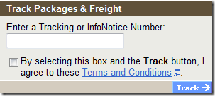
To continue down the path of looking up a simple tracking number, after I selected the country I was presented with this in the middle of the screen somewhere. At least UPS recognizes the fact the majority of times people visit their site they want to look up a tracking number (which could have been put on the first page I visit, but I digress):
Don’t you love it when lawyers at really large companies get a hold of web sites and pollute them with legal speak? I have no idea the statistics but I would guess only a few percent of people actually read those “Terms and Conditions”. Let’s punish the masses is what this says to me. How many times are we going to be subjected to this whereby a lawyer comes up with the idea that if he has the web developers put a check box on the web site it will keep people from doing wrong or that it will make them suddenly have a change of heart.
Oh no, there is a check box on this web page, I better not do this.
Did I check the box? Yes, because I had to or I couldn’t look up my information. Did I agree to it? Hell no. Did I read it? Nope. I could care less what it says. The sad truth about it is UPS could change those terms and conditions at any time without my knowledge and based on how the original terms were worded one could be bound to them.
Imagine If….
I think I may start putting these types of things into my blog. Every time someone visits my web site I’m going to present them with a screen asking for their country location. And then I am going to present them with a terms and condition before they can fully enter the site. I think my terms and conditions will read something like.
I hereby agree to these terms and conditions of this web site and understand this is a binding contract between the web site owner and myself. I understand by posting a comment to the blog the web site owner reserves the right to collect 50% of my annual salary payable in monthly installments. I also understand any comments added to the site considered by the web site owner not to be of a praising manner will be considered a defamation of character of the web site owner resulting in a fine of $1,000.00. Lastly I agree these terms and conditions can be altered by the web site owner at anytime and any newly published terms will also be a binding agreement.


I’m sure the reason why they make us go through all these hoops is to count every last click we make while we’re on their site. I’m a web developer myself and I know how frustrating it can be when a manager wants page counts while we just want it to work quick, fast, and easy.
In this example I would rather have the shipped who sent me the tracking numer just send me a link directly to the status of my package without having to go through ANY of this!