It has probably been four years since I last installed Linux from scratch. It isn’t that I haven’t touched a Linux command prompt or system in four years, it just that all of my installs are on my servers which just get updates applied. I decided to install Ubuntu Linux the other morning on an older Dell laptop I have replacing Windows. All this laptop is used for is surfing the web around the house. It lives next to my man chair (recliner) in the living room. The purpose of this exercise was twofold. From a usability point of view I wanted to see how easy the install of Linux had gotten and document my experience. And two I know there are a lot of people that have never even attempted to install Linux and I hope this helps those people at least play around. I will probably also use this install as a basis for some future topics as well as learning some new languages. Thus, you’ll probably see some new material coming out down the road.
The version of Ubuntu I downloaded was 8.04.1. After installing Ubuntu on my Dell I wanted to capture the install experience so I created a virtual machine using VMware Workstation and did another install. After getting presented with the initial boot screen I started capturing screen shots. Here is a walk through of installing Ubuntu along with some, man, that was cool, or wow that was stupid moments.
Installing Ubuntu
Step 0
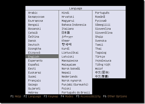
The very first screen a user is presented with when installing Ubuntu is the language screen. I’ll point out this screen doesn’t tell a user anything to do. I guess we are all suppose to know to press enter.

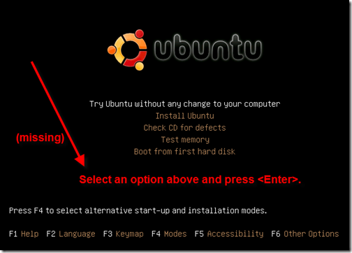
After selecting a language you are brought to this screen. Again it is missing that finer touch of UI polish by not telling the user what to do. The text in red is what I put in using Snagit so don’t think that was already there. I put it in to point out what was missing. I wanted to do an install so I pressed the down arrow on the keyboard (again not mentioned in the screen) and pressed enter.
Am I being picky? Not really. I can tell you right now any average computer user would question what to do next at this point.

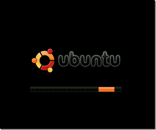
The next screen, while aesthetically pleasing, doesn’t tell me anything that is going on. What is my computer doing right now? Is it formatting my hard drive or what? This screen needs something to indicate to the user what the program is doing. I’m guessing it is loading the kernel in the background. This is much more pleasing to view than the kernel spit message after message but it still needs some type of interaction with the user.

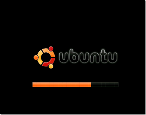
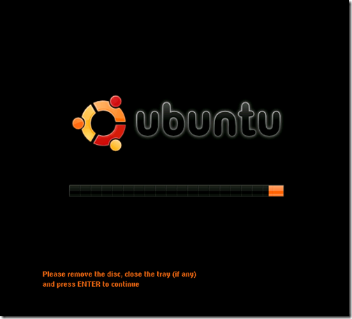
Knowing Linux the way I do I am sure this screen is loading necessary services Linux needs to load. Again, there is nothing to tell the user what is going on. Think about this for a minute. What if a user had to call into a support line and tell someone on the other end their computer locked up installing Linux? There are two screens that look very similar in nature. How would that be diagnosed?

Pretty. I dig the background of a penguin that looked like it got shot with a 12 gauge repeatedly. Seriously I like it. At this point we are in XWindows and we are going to start using the mouse to configure and setup the system. Linux has been moving to GUI based installers for years and it is nice to see some extra polish at this point, even if it is just the background.

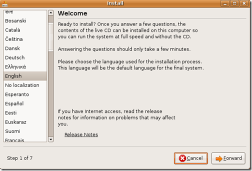
Step 1
Thus far I have had to press enter to select a language and then enter to kick off the installer. If you recall, the first thing it asked me for was to select my language. Well guess what? It is going to ask AGAIN! Why, I have no idea since I had already selected it earlier during step 0. It looks like this would have already been done for me. There is also something on this screen that bugged me. I’m not really sure why but the word “Forward” in the bottom right is the name of the button to move through the setup process. This just hit me as absolutely weird. It is like the developers are trying to be so different as to not put the word “Next->” there that it looses the meaning. Sorry guys I just don’t get that. When you tell me I am in step 1 of 7, I immediately don’t think of the word “Forward” to go to the forward step, I mean next step. See, it doesn’t even make sense when trying to explain it. This is yet another example of developers not calling a kettle a kettle ( see past forrest gump article).

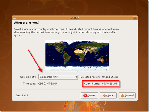
Step 2
This is the worst screen to deal with in the entire setup. This screen has been around for awhile and I didn’t like it then and I don’t like it now. Why? The whole select a city is absolutely horrible. Why the standard time zones aren’t printed here I have no idea. I can’t begin to describe how frustrating it is to find a city with the proper time zone. Not to mention there are literally hundreds of options in the menu. It is not easy to navigate. I just looked at the time zone selector on Windows and there are 1/20th of the options available comparatively speaking when one just displays standard time zones.
There is an option of clicking the little itty bitty tiny very small ever so miniscule yellow dots with the hopes and prayers you select the right one too.

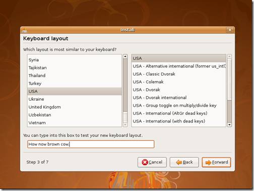
Step 3
This screen is easy. The nice thing that was done is the ability to select an option and see if it still works. Let’s go forward, I mean next.

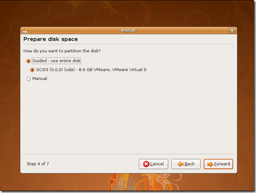
Step 4
If you are setting up a machine and having Linux take up the entire drive this is pretty simple but still not very gump. With some minor UI work this could be simplified. I’m not really sure why the word “Guided” is even there. Why not just say “Use the entire disk” ? There is nothing guided about it since we are at step 4 and as we see the next step asks us for information.

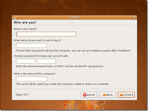
Step 5
This is pretty simple. Fill out the form and move on. Easy and simple.

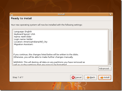
Step 7
Somehow step 6 doesn’t exist. I don’t know where it went. Maybe it was a step that didn’t have a user interface, who knows. We went from 5 to 7 get over it and let’s move on. It is driving me crazy too!
Step 7 is basically a review screen, not really enough to warrant a step. I think it could be eliminated.

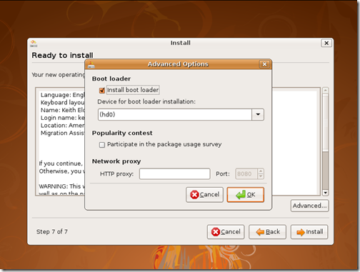
Step 7.1
I couldn’t resist to see what was behind the curtain of the “Advanced…” button. Turns out it was just asking if we wanted to change the boot loader option. I think this should have been asked back in step 4. It seems out of place having it here.

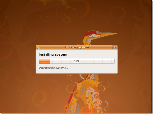
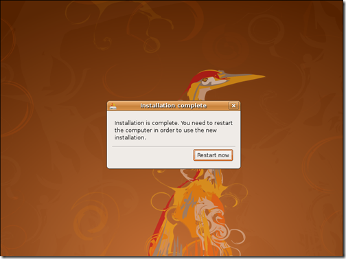
After pressing install the installation goes really quickly. On my Dell I think it was installed in like 5 maybe 10 minutes.


First Boot Up
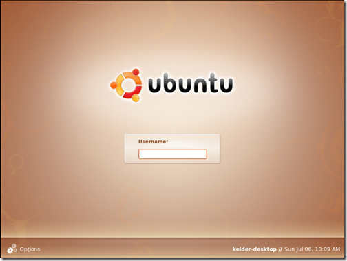
After the system boots for the first time you are presented with a login screen that is really nice.

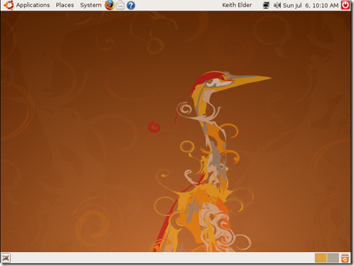
After logging in you are brought to the initial desktop for Ubuntu 8.04.1. At the top are the Gnome menus and the bottom is used as a task tray to switch between open applications.

Updates
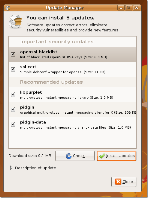
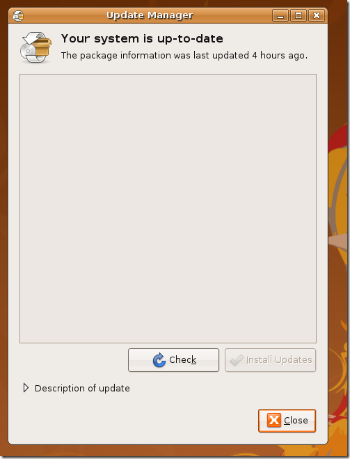
A few minutes after being booted the first time Ubuntu went into action and prompted me about new updates for the operating system.

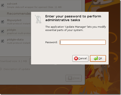
When pressing “Install Updates” the administrator or root password is needed. This is the password created for the account account back in Step 5. For users who don’t know about how Linux uses permissions this may not be that obvious. It would be nice to see this explained the first time a user is asked.


Installing Additional Software in Ubuntu
Ubuntu is based on Debian Linux and uses the same packaging system called apt. If this is your first Linux install you will want to open a terminal or use the Synaptic package manager application to install additional software. For example if you want to install the Eclipse IDE open a Terminal window and type the following:
sudo apt-get install eclipse
The word “sudo” is used to execute commands with evaluated privileges in Unix if it has been configured. Unix systems refer to this as “root” whereby Windows refers to it as “Administrator”. The rest of the command “apt-get install eclipse” will go out and download and install Eclipse. If you want to see what additional plugins Ubuntu supports then search the package management system using apt-cache. Here’s is how.
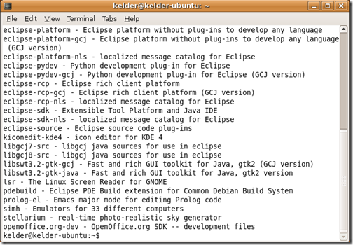
apt-cache search eclipse
This command will print all of the packages that have the word eclipse in them as shown here.

Those are the basic commands you need to know to install and find software to play with. Read and learn apt, it is your friend.
Thanks Ubuntu For Just Working
One of the really nice things Ubuntu did after being installed was do something I never got to work on Linux back in the day and that was wireless networking. I almost cried when I clicked in the upper right of the screen and saw my home wireless network. I selected it and I was online wirelessly! I remember spending countless hours trying to compile a wireless driver for another Dell I had before surrendering to defeat. Needless to say I was shocked at just being able to select a wireless location and it work. I’m still shocked.
Another thing Ubuntu did after being installed on my Dell was to tell me my battery may have been recalled and there was a non-free video driver that I could use. I downloaded the driver and restarted. I immediately saw a difference in speed.
For my Dell that sits in my living room Ubuntu is an easy choice. It comes with Firefox 3, Evolution for email as well as Open Office. That’s about all I really need for leisure browsing after work. I’ve already been playing around with Mono, Python and a few other things that I wanted to catch up on and it is a great feeling to be back at a real command prompt.


