

Communicating Your Project Statuses To The Business
Posted by Keith Elder | Posted in Programming | Posted on 26-10-2007
As a team leader, one of my duties is one of the toughest jobs in the software business and that is communicating where a gigantic project is status wise. There are entire books written on just how to judge where a project is as well as how to do projections and estimations. Like everyone else I struggle with guesstimating when something is going to be done. This is what forced me to change my quote for the blog recently to:
Software is ready to be scheduled for production when the last line of code is written.
While somewhat of a play on words and the truth, almost everyone has trouble communicating statuses of their projects to the business. As you move up the chain of command it gets even harder. As you move from Engineer->Team Lead->Director->CIO->CEO the less information is needed.
At work we’ve been working on a major redesign on one of our core systems. Not that we built it incorrectly when we built it mind you. The product has just grown and taken on more responsibility. Before we took on a huge chunk of extra responsibility we knew we were going to need to restructure a lot of things around. Things were easy when we first built it. Several years later the system has grown into a really large system with a lot of integration points and moving parts. With so many parts and integration points how do you calculate the whole project? Beyond that how do you show someone where you at without them having to read a 10 page report? I struggled with this for some time and then stepped back and thought about it for a bit.
What I came up with was a simple one page picture that I put together in PowerPoint to represent all the different pieces and the status of each of those. As each week progresses I can then easily update the PowerPoint with the new percentages of work that was accomplished. Here is what I came up with.
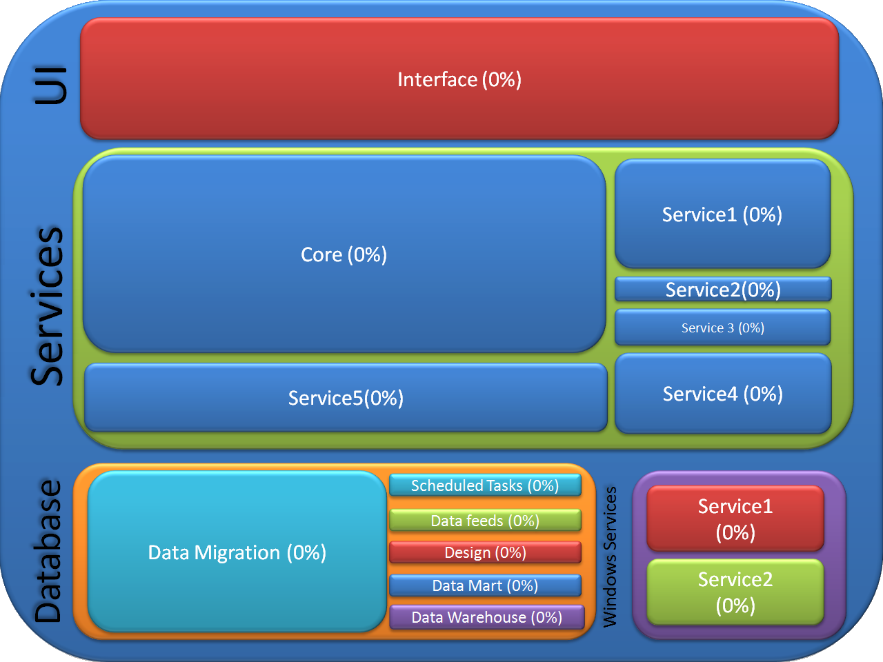
After a quick glance of the above image we can easily deduct that our largest body of work on this project is the Core in the services tier. Second is the user interface and then third is the data migration. It is important to communicate this to the business. The reason is it helps to set expectations. If I told someone at work, “Well we are 60% done with our Core service work.” To them that might sound great. But in context it is still only about 40% of the overall work for the services tier that needs to get done and then only about 5-10% of the overall project. I sent this out to a team member who was not involved with the project but asked how things were going. The first thing they came back with was, “Wow, I didn’t know the project was that big!”. I think I accomplished my goals of A) showing all the moving parts of the project B) simplifying the complexity of it and C) minimal reading.
For those that may be interested in trying this approach out I am attaching the PowerPoint I created. Feel free to download and use it. Let me know how your mileage varies with it. I am still “testing” it out myself.
Jim, good to see you out and about these days.
Let me try to put this TFS generating the diagram scenario to rest once and for all for you, Wren and Holmes. TFS works great if you are building a software deliverable, single item of work. Where it fails down on its face in more than one way is large scale projects that make up some software deliverable items and then others, that aren’t software related. Then how about tasks associated with other teams that don’t even use .Net? See my point?
In the case of the project I was mocking this “fake” diagram after it would make more sense if I plugged in my real world values but because that would be crossing the line of our business I filled them in with stuff I made up. Taking that into consideration what you don’t see is the project crosses too many boundaries to serve up everything from TFS or CC.NET.
In other words, where do you put the tasks for the programmer that has to alter their system for integration? What about the 4GL programmers that have to add new functionality to their system and the PHP programmers who have to build out a whole new interface that is made up of items reliant on Marketing. When is the “integration” piece of the application done? Really you don’t know by looking in TFS because the tasks aren’t there! Then you have the database folks who don’t use TFS. The list goes on an on an on.
While it is great to think generating this chart would be a great a idea (and in some scenarios it would) it isn’t practical. So now that you see the larger picture I was trying to convey without giving the farm away I hope you see where I am coming from.
My problem with slides like this is how you determine what “we’re 60% done” means? Also, how do you adjust when business needs drive a change and add/remove features or work from your list at some point?
If that chart’s being driven by something like a Scrum backlog chart which is dynamic reflecting the number of feature hours accomplished vs remaining, then I’m hip with it. Otherwise it seems like an inacurate portrayal.
Please note I’m not throwing snarkiness your way — this is just my general pain with anything other than a Big Visable Chart updated with makers…
I agree that much of this data should be in TFS, so it’s a matter of tweaking the various reports or using the “Remaining Work Items” query and doing some Excel magic.
Same question/statement as Josh I guess.
You just need to your CC.NET server to create that graphic for you after every build!
What would be extra slick would be to have the different features/bugs/work items in your system be assigned to one of the areas above and have the power point pull automatically and populate itself.
thoughts?